
Stocks & Bonds: Return Characteristics
Before we jump into results, the next few paragraphs introduce several return concepts. Anyone already familiar with them can scroll down to the Tabs. For those unfamiliar, a basic understanding of these concepts is essential for this section and any that follow it in the Topics library. Don’t worry, there’s only one basic equation to understand and the concepts are crucial but simple, and even prove helpful when reading a quarterly account statement!
Return Calculation
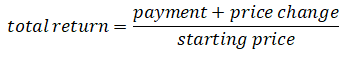
In the Primer section we defined a security’s investment return as its payment to or accumulation of value to its owner, over and above the security’s original value. The return for a single period is measured as below:
Return Calculation
In the Primer section we defined a security’s investment return as its payment to or accumulation of value to its owner, over and above the security’s original value. The return for a single period is measured as below:
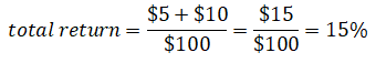
For example, a security that starts the period with a price of $100, pays $5 during the period and whose price rises by $10 during the period has a 15% return, as below:
A security’s return can be measured over any time period – a minute, a day, a month, a year, a decade, etc. To accurately include the reinvestment of every period’s payments, each return is first calculated over a short period or "sub-period" as shown above, and the sub-period returns are then linked together geometrically. Examples are given in the Details tab.
We summarize returns over longer periods with one of two measures:
- Compound Average Return: a geometric average that shows the investment’s total growth over all sub-periods. It's usually expressed on an annualized, percent-per year basis.
- Arithmetic Average Return: a simple average, measured as the sum of returns across all sub-periods and then divided by the number of sub-periods. It is also usually converted to and expressed on a percent-per-year basis.
Risk/Volatility
Risk takes many forms. One definition of risk is returns that are insufficient to meet an investor’s needs, but this definition is specific to each individual and so it can’t be condensed into a single measure equally applicable to all investors.
Another form of risk is that which investors face from ongoing security price fluctuations or choppiness, even if those fluctuations are only temporary. This form of risk applies equally to all investors in the same security and is referred to as Volatility, which is calculated as the standard deviation of returns and is described at length in the Details tab. We often display returns graphically so that their volatility is visually apparent.
Return Summary Measures & Volatility
The Compound Average is our default summary measure of returns because it reflects volatility’s effects on returns, whereas the Arithmetic Average overstates an investment’s growth when returns are volatile (i.e. nearly always). An example is shown in the Details tab.
We restrict our use of the Arithmetic average to only those situations in which volatility is also shown and compared. When there’s any potential for confusion, we specify which measure is shown.
Return Index
An index is a measure that summarizes and represents the returns of an asset class, and consists of one or more securities in that asset class. An asset class includes securities legally similar to each other but different than those in other classes (stocks vs. bonds), and also those in the same legal category but whose performance meaningfully differs for other structural reasons (government bonds vs. corporate bonds, long- vs. short- maturity government bonds, information technology stocks vs. energy stocks, etc.).
Because the stock returns of different companies are very widely dispersed, no single stock is representative of the entire group and stock indexes therefore include very many stocks. In this section we use the Standard & Poors 500 index (“S&P”) as our proxy for stock performance. The S&P represents the weighted average stock return of about 500 of the largest US-based companies.
The government bond indexes in this section each contain only one bond at any time. That bond is continually replaced to maintain the index’s maturity profile. For example, a 20-year bond is first used in the long-term bond index, and after a year passes and it has only 19 years left to maturity, that bond is replaced by another which still has 20 years remaining to its maturity.
Preface
- This section analyzes only US stocks and government bonds.
- US stocks and government bonds have a much longer return history than comparable asset classes in other countries.
- The US financial market is the world’s largest as measured by the aggregate value of its financial assets.
- Other countries and asset classes are shown in later sections.
- The four asset classes shown include US large-company stocks, represented by the S&P 500 index, and US federal government bonds with maturities of about 1-2 months ("Treasury Bills or T-Bills"), 5 years ("Intermediate") and 20 years ("Long").
Main Results
- From 1926-2019, compound annual returns range from 3.3% for T-Bills to 10.2% for US stocks, with Intermediate and Long bond returns in the middle.
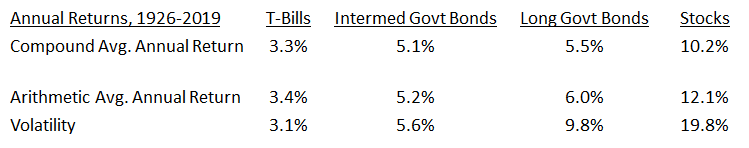
- Return and volatility both increase from the least-risky category, T-Bills, through to the most risky category, stocks.
- Extreme and negative returns are far more pronounced and frequent for stocks than for bonds. Stock returns are negative in nearly one of every four years, even outside the Great Depression. Extreme positive and negative returns are much smaller for long government bonds and they diminish even further for intermediate bonds and T-Bills.
- The risk/return trade off aligns with the concepts in the Primer section.
- Stocks’ high volatility is very significantly reduced through longer holding periods.
- Annual stock returns are negative over a quarter of the time and average -13% in those years, but 10-year annualized stock returns are negative less than one-twentieth of the time, only four periods out of eighty-five, and average not even -1%/year when they are.
- With each increase of the holding period length, extreme stock returns shrink considerably
Inflation & Risk
- Inflation adjustment determines if an asset class’s returns exceed inflation over a given period. If not,the asset class’s purchasing power declines.
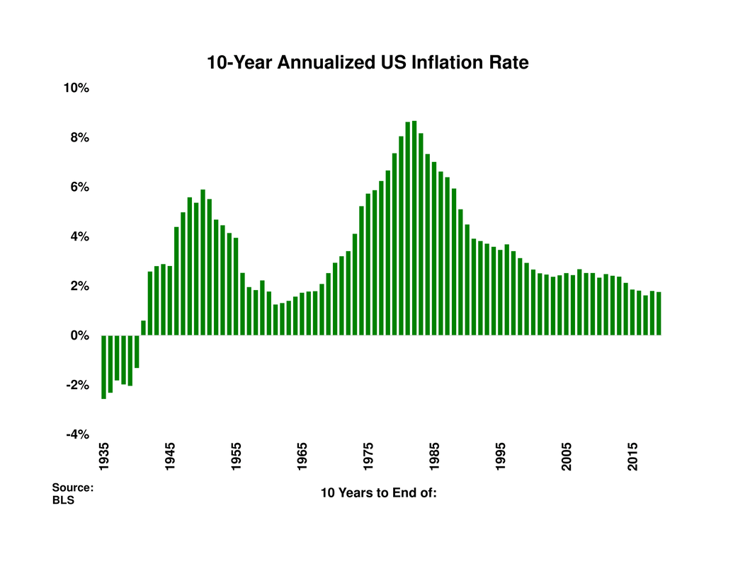
- US inflation is positive in every ten-year period outside the Great Depression, with peaks in 1950 and also at the end of the “stagflationary” 1970’s.
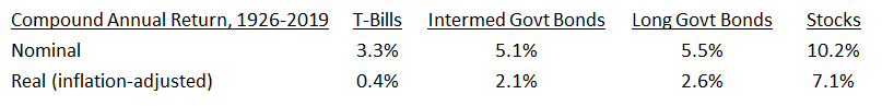
- Nominal returns are compared to inflation-adjusted (“real”) returns in the following table. Real returns are markedly lower than nominal returns, and real T-Bills returns are barely positive.
- Real T-Bill returns over ten-year periods are negative during several episodes, including the post-WWII economy, the rising inflation of the 1970’s stagflation and also the low interest rate environment of the 2010’s. Across the eighty-five ten-year periods, real T-Bill returns are negative 44% of the time.
- Real ten-year stock returns are negative in only 12% of all periods and in two broad episodes, the late 70’s/early 80’s and 2008-2010.
Conclusion
- A risk/return trade off is apparent in nearly a century of investment performance; average return rises along with risk (volatility).
- Inflation adjustments highlight volatility’s inadequacy as a standalone risk measure.
- T-Bills are easily the safest class based on their low annual volatility.
- If we define risk as the chance of not matching inflation over longer holding periods, T-Bills’ safety disappears: they underperform inflation in 44% of ten-year periods.
- Stocks are very volatile by year, but underperform inflation only 12% of the ten-year periods.
- Stocks’ occasionally dreadful short-term results flow naturally from their position at the “bottom of the pecking order”:
- Stocks’ future prospects are inherently less certain than government bonds’.
- The emotional swings during a recession’s approach should (and do) take their greatest toll on the least-certain asset class, stocks.
- Over time, extreme emotions dissipate and so do emotion-driven swings in share prices.
- As emotions subside, the ultimate sources of stock returns - companies’ operating profits and their growth - predominate.
Preface
This section examines only US stocks and government-issued bonds, as each has a much longer return history than comparable asset classes from other countries. The American financial market was and is the world’s largest as measured by the aggregate value of its financial assets, and so between its size and its extensive history it forms a natural starting point for analysis of historical returns. We defer US corporate bond and other countries’ stock and bond returns to later sections.
In addition to the large-company or "large-cap" stocks represented by the S&P 500 index, returns from three categories of US federal government bonds are shown, those with maturity of about 1-2 months ("Treasury Bills or T-Bills"), 5 years ("Intermediate") and 20 years ("Long"). All returns in this section are expressed in US dollar terms.
In addition to the large-company or "large-cap" stocks represented by the S&P 500 index, returns from three categories of US federal government bonds are shown, those with maturity of about 1-2 months ("Treasury Bills or T-Bills"), 5 years ("Intermediate") and 20 years ("Long"). All returns in this section are expressed in US dollar terms.
Main Results
From the start of 1926 to the end of 2019, the compound return averaged 3.3% for T-Bills, 5.1% for intermediate government bonds, 5.5% for long-maturity bonds and 10.2% per year for US stocks. Compound returns are shown below along with the arithmetic average returns and volatility.
The results broadly confirm the reasoning from the Primer section. Return and volatility both increase from the least-risky category, T-Bills, through to the most risky category, stocks.
|
Each category’s annual return history is shown in the charts to the right, which can be scrolled through by clicking on the left or right arrows at the chart's sides or on the thumbnails at its bottom. The charts are all drawn to the same scale to allow for comparison. Extreme returns are far more frequent for stocks than for bonds. Even excluding the Great Depression years of the 1930’s, stock returns are negative nearly once every four years. Many negative stock returns are very sizeable, for example the -15% and -27% returns of 1973 and 1974, consecutive returns of -9%, -12% and -22% beginning in 2000, or the -37% decline during the 2008 global financial crisis. Extreme positive and negative returns are much smaller for long government bonds and they diminish even further for intermediate bonds and T-Bills. The final chart in the series plots each asset class’s arithmetic average return on the vertical axis against its volatility on the horizontal axis, to illustrate the risk/return trade off across the various asset classes. |
|
Stock Volatility and Long-term Investors
|
Stock investors who don’t react to short-term volatility were well-served by their patience, as shown in both charts in the slide to the right. The first displays the pattern of overlapping ten-year annualized returns. (By overlapping, we mean that nine of the ten years ending in 2010 overlap with nine of the ten years ending in 2011, etc.) Annual stock returns are negative more than a quarter of the time but the ten-year stock return is negative in only four of eighty-five periods. The second chart shows the highest and lowest annualized return for holding periods of various lengths. With each increase of the holding period length, the extreme returns shrink considerably. |
|
Inflation & Risk
The returns shown so far are measured in nominal returns, which don’t account for inflation’s impact. Inflation lowers a currency’s purchasing power, and an investor’s ultimate goal is to attain positive returns over and above inflation, otherwise their portfolio’s purchasing power declines
|
Inflation-adjusted returns or “real” returns are calculated by reducing any period’s nominal return by the same period’s inflation rate. For example, if a security’s return is 5% and inflation is 2%, then the security’s real return is approximately 5% - 2% = 3%. The exact formula is a geometric adjustment, described in the Details tab. US inflation is measured by the All-items Consumer Price Index for All Urban Consumers, CPI-U. Other than during the Great Depression, US inflation is positive over all ten-year periods in this sample, as shown to the right. The chart traces the change from the Great Depression's deflation to the temporary inflation that accompanies the post-War adjustment to the peacetime economy. It then traces the late-60's and 1970's simultaneous rise of inflation and unemployment ("stagflation"), and the 35+ year disinflation that follows. |
|
Nominal returns from the first table are compared to real returns in the following table. After adjustment for inflation, all returns are markedly lower and real T-Bills returns are barely positive.
|
The slides to the right show the pattern of ten-year real returns for T-Bills and for stocks. Real T-Bill returns are negative for several extended periods, not just during the immediate post-WWII economy when interest rates are very low but also through the 1970’s when inflation rises faster than interest rates can adjust. Real T-Bill returns are also negative in the 2010’s, when interest rates are kept very low to counter the effects of the 2008 financial crisis and global recession. Real T-Bill returns are negative in 44% of the eighty-five ten-year periods. In contrast, real stock returns are negative in only two extended periods. The first includes the mid-1970’s and early 1980’s and reflects the aforementioned stagflation environment. The second is 2008-2010 and reflects the 2008 financial crisis, which occurred only six years after the 2000-2002 collapse of the late-90’s tech/telecom stock market bubble. Real ten-year stock returns are negative only 12% of the time. |
|
Conclusion
Over nearly a century, a risk/return trade off is apparent in the major US asset classes’ investment performance. Average returns and volatility both increase as government bonds’ maturity increases. Stock return volatility is much higher yet than bonds’ but is compensated for by higher stock returns. Moreover, as the holding period lengthens, stocks’ volatility declines, their extreme returns become more moderate, and the likelihood of a negative overall return drops commensurately.
Inflation adjustments highlight volatility’s inadequacy as a standalone risk measure. T-Bills are easily the safest asset class based on their annual volatility. But if we instead define risk as the likelihood of not matching inflation, over longer holding periods T-Bills’ safety becomes illusory: they don’t match inflation in 44% of ten-year periods, whereas stocks fail to match inflation in only 12% of ten-year periods and exhibit a far higher average real return.
The explanation for stocks’ strong long-term performance despite some dreadful short-term results is that, as described in the Primer section, stock owners get paid last; they’re at the “bottom of the pecking order” whether viewed from the perspective of a balance sheet (Levels) or income statement (Flows). Stocks' future prospects are inherently less certain than government bonds’. It’s unsurprising that the emotional swings during a recession’s approach have their greatest effect on the least-certain asset class, stocks.
But over time, extreme emotions dissipate and so do emotion-driven swings in share prices. As extreme emotions subside, companies’ operating profits and their growth – the ultimate sources of stock returns – instead come to the fore.
1a) Arithmetic and Compound Average Returns
An arithmetic average return is the simple average we learned in grade 10, namely the sum of each subperiod’s return, which is then divided by the number of subperiods.
A compound average first tracks an investment’s growth by geometrically linking together the different subperiod returns. To calculate the total growth of an investment over n periods, the geometric average first uses the following formula:

If we label the first subperiod return as r1, the second subperiod return as r2, etc. the equation becomes:

Equation A is the first cousin of the formula for the growth of a dollar invested in an interest-bearing investment, that has an interest rate of r percent every year over n years:

When returns are the same in all periods, formula A reduces to formula B. But when returns differ across periods, formula A must be used to accurately track the investment’s growth.
The compound average return is then calculated from the investment’s total growth over n subperiods as follows:
The compound average return is then calculated from the investment’s total growth over n subperiods as follows:
When returns across different periods are identical, the Arithmetic and Geometric averages are the same, as below:
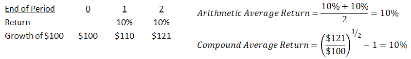
But when returns differ across periods the Arithmetic and Compound averages provide different results, as below when a 50% increase is followed by a -50% decline:
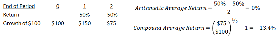
The two methods lead to different conclusions. The Arithmetic average of 0% leads to the incorrect conclusion that the investment’s value is unchanged at the end of both periods, whereas the Compound average correctly flags the investment’s decline.
Though the second example above uses extremely volatile returns, the results in this section’s Main tab confirm its reasoning. As we move across the first table from the less risky to the more risky asset classes and volatility rises, a significant gap opens between each category’s arithmetic and compound annual returns. For stocks the gap is nearly 2% per year, their arithmetic average of 12.1% per year less their compound average of 10.2% per year.
1b) Subperiod returns can be geometrically linked into a single series of numbers using the same method as in equation A. The resulting series is known (somewhat confusingly) as a return index, and greatly simplifies the calculation of compound average returns because only the index’s starting and ending values for the period in question are required, not all the interim subperiod returns; they’re already built into the return index values.
For example, a return index is shown below for five years of returns, where we arbitrarily assign the return index a starting value of 100:
For example, a return index is shown below for five years of returns, where we arbitrarily assign the return index a starting value of 100:
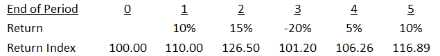
The return index lets us calculate the compound average return between any two points among the five years without having to first calculate the starting and ending values, because they’re already built into the return index.
2a) Volatility
We calculate return volatility (choppiness) as the standard deviation of returns, as shown below:
We calculate return volatility (choppiness) as the standard deviation of returns, as shown below:
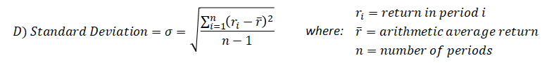
The formula looks a little threatening but its intuition is actually quite simple. The standard deviation is the square root of the variance, and the variance is the average squared distance of each individual return from the overall average return. Thus if two return indexes both have the same average return, the standard deviation will be higher for the index whose returns lie farther on either side of its average.
|
This is shown in the two charts to the right, which are drawn to the same scale for comparison and which both have an average of 10% (in orange). The second chart’s returns are dispersed far more widely around its average than are the first chart’s returns. The second chart’s returns are actually a direct transformation that maintains the first chart’s returns’ average, but gives them twice the volatility. |
|
2b) The historical returns shown in this section have nearly a century of results, which allows volatility to be calculated using annual returns. But most investment performance is measured over much shorter measurement periods, typically no longer than ten years and often as short as one year. The standard deviation in formula E requires at least two observations and for practical purposes gives misleading results with fewer than about ten observations, and so for shorter overall periods such as 1-10 years volatility is usually calculated using shorter return subperiods such as months or quarters.
After the volatility is calculated with either monthly or quarterly returns, it can be converted to an annualized basis by multiplying it by the square root of 12 or 4, respectively. This method is used in the performance charts in the About section, which cover periods as short as five years and which use monthly returns to calculate average and volatility for each portfolio program’s funds.
A slightly more accurate formula for annualizing the monthly or quarterly standard deviation is as follows:
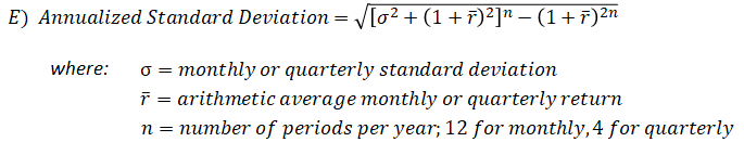
Volatility calculated using short subperiods is nearly always used to compare different asset classes or funds over the same time. Both the simple annualization rule and the more complex version in equation E are monotonic transformations that leave the order of the various participants’ volatilities unchanged. For example, a group of mutual funds whose volatilities in a given period are ranked highest to lowest will have the same rank whether the volatilities are all annualized with the simple annualization rule, or with equation E. Because equation E introduces considerable complexity without any gain in insight, all our annualized results from shorter subperiods instead use the simple annualization rule.
2c) As a measure of financial asset risk, return volatility or standard deviation has several flaws. First, it assumes that returns are distributed symmetrically around their average, whereas investors tend to care mainly about returns that lie below the average and don’t worry about those that lie above it. This is a valid concern but it is addressed by noting that those assets and securities with higher volatility exhibit extreme returns on both sides of their average. In our experience, other measures that focus only on below-average returns, such as negative semi-deviation, add computational and other complexity but little or no extra insight, and so we ignore them.
A more important concern is that standard deviation and average both stem from the “normal” distribution of classical statistical theory (think back to bell curve diagrams). But extreme financial market returns, particularly declines, occur with greater frequency and in much larger magnitude than predicted by the normal distribution; financial market returns are said to have “fat tails.” This concern is also addressed with a simple modification, namely the application of the average and standard deviation to a fat-tailed distribution rather than to the normal distribution, for example a T-distribution with 4 or even 3 degrees of freedom.
A more overarching concern is that volatility and standard deviation are not risk; they merely proxy for risk in a very imperfect manner. Security prices do not have a volatility “attached” to them per se, but instead their volatility is a result of the give-and-take of trading in secondary markets, which in turn reflects both short-term emotion and fundamentals pertaining to the issuer. For example, a stock’s risk derives directly from its issuing company’s operations, viability and growth prospects. Its share price will exhibit volatility but that volatility is not risk; the volatility is a result of the company’s underlying risk and changes thereto. Volatility tells us with great accuracy if returns were choppy in the past; it tells us far less about the future.
3) Return Indexes
3a) An index of security returns is nearly always weighted by each security issue’s market value at the start of each measurement period. An issue’s market value, also referred to as its market capitalization, is measured the product of the number of securities outstanding and the price per issue. For example, a company with one million shares outstanding and whose share price is currently $10 has a market capitalization of 1 million shares x $10/share = $10 million.
If at the start of a period company A’s stock market capitalization is $10 million and company B’s is $20 million, then A’s weight in a capitalization-weighted stock index will be half that of B’s weight.
The companies’ relative index weights may change at the start of the next measurement period if their relative capitalizations change, which can occur for one of two reasons. First, either company may issue more shares or buy back and cancel some existing shares. Second, and far more common, their share prices diverge over the period.
3b) A capitalization-weighted index that includes all of a market’s listed securities represents the aggregate return of all investors in that market. This concept is crucial to understanding the limits of active management, which we discuss in the Active Management section.
3c) Many indexes are float-capitalization-weighted. A company’s “float” represents those securities outstanding that are readily available for trading and are not tightly held by, for example, the company’s founder, other control groups, governments, other companies, etc.
Float-capitalization has very little impact on most indexes because the overwhelming portion of bonds and shares are not tightly held. It slightly changes the interpretation of an index’s performance: a float-capitalization-weighted index represents the aggregate returns of all investors in that market, excluding those who own the tightly-held securities.
Float-capitalization has very little impact on most indexes because the overwhelming portion of bonds and shares are not tightly held. It slightly changes the interpretation of an index’s performance: a float-capitalization-weighted index represents the aggregate returns of all investors in that market, excluding those who own the tightly-held securities.
3d) Capitalization weighting is needed to accurately represent a market’s returns for two reasons, both particular to financial markets. First, issuers have very different sizes. At the end of 2020 the S&P 500’s largest member (Apple) had a capitalization of $2256 billion, roughly seven-hundred times larger than the $3.2 billion capitalization of its smallest member. Weighting the two stocks’ contributions evenly would be a gross distortion of the returns available to investors.
Second, different securities experience very different returns over the same time period. For example, in 2020 Adobe Systems’ share price rose 52% whereas IBM’s price fell about 6%, although both companies belong to the Information Technology sector of the S&P 500 index.
3e) Most indexes don’t reflect the impact of taxes, although some try to include the impact of foreign withholding taxes on dividend payments. None reflects the trading costs involved when new members (constituents) are added to the index and existing members are removed.
4a) Having few or even only one component or member doesn’t present as much a problem for government bond indexes as it does for stock indexes because government bond returns are far less dispersed than stock returns. For example, a US government bond with 20 years left to maturity exhibits very similar returns as those with 19 or 21 years to maturity. All three will differ more from a 5-year government bond, which in turn differs from a 3-month government bond (commonly referred to as a T-Bill), due to their different maturity profiles.
In contrast, individual stock returns exhibit enormous variation. It’s standard for the highest- and lowest- performing stocks in the S&P 500 in any year to have returns that differ by more than 100 percent. For example, in 2019 Apple’s share price rose more than 85% and 3M’s fell by over 7%, a 92% difference. These weren’t even the top- and bottom-performing stocks in the index that year; they were just two that we found in less than ten minutes to illustrate this point!
In contrast, individual stock returns exhibit enormous variation. It’s standard for the highest- and lowest- performing stocks in the S&P 500 in any year to have returns that differ by more than 100 percent. For example, in 2019 Apple’s share price rose more than 85% and 3M’s fell by over 7%, a 92% difference. These weren’t even the top- and bottom-performing stocks in the index that year; they were just two that we found in less than ten minutes to illustrate this point!
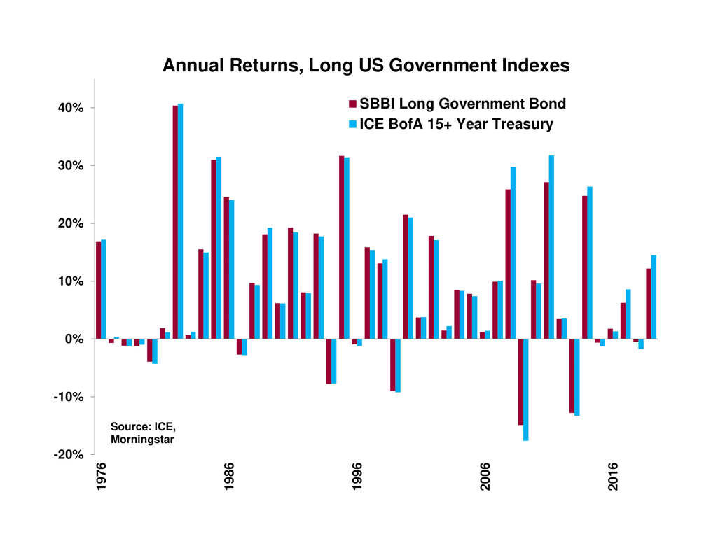
4b) The SBBI Yearbook’s Long Government Bond index that we use in this section consists of only one 20-year maturity bond at any time. Even though government bonds of similar maturities have similar returns, they still exhibit slight differences and so it's preferable that an index contain multiple bonds. However, the main commercially-available bond indexes start in the 1970’s at the earliest and often don’t have yields or separate income and price returns available until at least the 1980’s, whereas the SBBI Long Government Bond index’s has yields and total, price and income returns all available from 1926.
We compare the SBBI index's returns to those of a similar index, the ICE BofA 15+ Year US Treasury Index, whose monthly return history begins in 1976. The latter includes all US Treasury bonds with a maturity greater than 15 years, as of January 2021 contains 56 different bonds and from June 1986 onward never contains fewer than 20 bonds.
We compare the SBBI index's returns to those of a similar index, the ICE BofA 15+ Year US Treasury Index, whose monthly return history begins in 1976. The latter includes all US Treasury bonds with a maturity greater than 15 years, as of January 2021 contains 56 different bonds and from June 1986 onward never contains fewer than 20 bonds.
|
The two indexes' summary return statistics are shown in the table below and their annual returns are shown in the chart to the right. The two indexes are very close substitutes though the first contains only one bond and the second contains many. 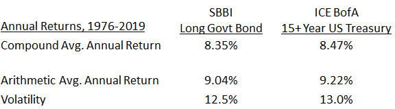
|
|
5a) The S&P 500 index contains approximately five hundred of the largest US companies whose shares are listed on US stock exchanges, where size is measured by stock market float-capitalization. Other criteria are also used to determine whether a company is added to or removed from the S&P 500. The index members and performance are maintained by index division of the the S&P Global company.
5b) The S&P 500’s 505 members’ total float capitalization of $33.3 trillion at the end of 2020 represents about 81% of the $41.3 trillion float capitalization of the S&P Total Market Index, which contains 3,820 members and is meant to represent the entire US stock market. Stocks in the latter index are not included in the S&P 500 for one of two reasons, either because they’re too small or because they don’t meet one or more of S&P’s other index inclusion criteria such as liquidity or financial viability, restrictions on initial public offerings (IPOs), restrictions on multiple share classes, etc.
5c) The S&P 500 index results prior to March 1957 represent those of the S&P 90 index, a daily index which began on a “live” basis in 1928 and whose 1926 and 1927 results were backfilled. The S&P 90 index has about a 1% higher annual return between 1926 and 1957 than the S&P Weekly index of about 400 stocks that was also compiled by S&P during this time and later modified by Wilson and Jones to allow month-end comparison. The S&P 90 outperforms the modified Weekly by 3.0% and 3.9% in 1926 and 1927, which might represent backfill bias but might also be an innocuous result of the “roaring twenties” effect on the largest companies’ stocks, much like that of the 1970s’ “Nifty Fifty”. The S&P 90 also outperforms the modified weekly index by 0.6% per year from the end of 1929 to the end of 1956, when both indexes were live.
Wilson, Jack W. and Charles P. Jones, 2002, An Analysis of the S&P 500 Index and Cowles’s Extensions: Price Indexes and Stock Returns, 1870–1999, Journal of Business, 75, 505-533.
6) Some caution should be exercised when applying the historical American results to other countries because the US mainland never experienced the extreme financial or physical destruction encountered elsewhere. US shareholders would have fared worse had American industry been subjected to the same bombing as Great Britain during World War II, let alone the wholesale destruction of the German and Japanese industrial bases as that war wound to its end. A non-war example of disaster avoided by US investors (albeit slightly outside our analysis period) is the 1921-1923 hyperinflation of Germany’s interwar Weimar Republic, which left German bondholders’ investments worthless.